Creating Tutorial
Creating a new Tutorial
Press “Create a New Tutorial”. Give it a name if you want (e.g. Newbie Tutorial). Then press “Add Frame”. You should now see a lot of options:
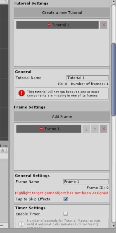
This is where you're going to spend most of your time with Tutorial Master. All options are available: effects, audio etc.
Features
General Settings

| Name | Description |
|---|---|
| Frame Name | Makes it easier to identify other frames from each other |
| Frame id | Shows the id of the current frame |
| Tap to Skip Effects | If set true, while in game, if you click anywhere, the current animation (icon fading in, text flying in etc.), will be skipped |
Timer Settings
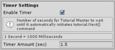
Enable Timer – the timer will automatically go to the next frame after X seconds has passed Timer Amount (sec) – how many seconds to wait till to go to next frame
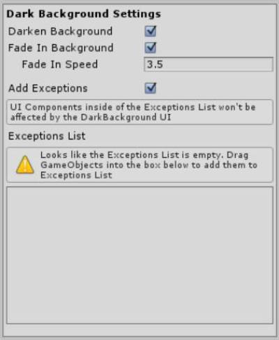
Dark Background Settings
| Name | Description |
|---|---|
| Darken Background | If set true, dark background will appear, covering everything except arrow, icon, text, highlight target and exceptional objects (if specified) |
| Fade In Background | The dark background will fade in when the frame is being played. Recommended to be used once at the beginning of the tutorial for full effect |
| Fade Speed | How fast do you want background to fade-in? |
| Add Exceptions | If set true, dark background will ignore some of the selected objects |
| Exceptions List | GameObjects that would be ignored by the dark background. Add them by dragging them into the window |
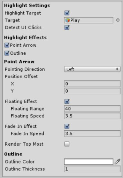
Highlight Settings
| Name | Description |
|---|---|
| Highlight Target | Do you want to highlight target in this frame? |
| Target | UI GameObject that you wish to be highlighted |
| Detect UI Clicks | This option is available only if your UI target is a button (or has a Button component attached to it). If set true, if player presses the button, it will go to the next frame. It does not affect current OnClick() events the button has. |
| Point Arrow | If set true, an arrow will be pointing at your UI target |
| Pointing Direction | From which direction you want the button to be pointing? |
| Position Offset | If you want to customize the distance between the UI target and arrow |
| Floating Effect | If set to true, the arrow will have floating effect |
| Floating Range | The bigger the range, the further maximum distance arrow will float from UI target |
| Floating Speed | How fast arrow floats |
| Fade In Effect | If true, arrow will have a fade-in effect when the frame starts |
| Render Top-Most | If true, arrow will be rendered on top of everything |
| Outline | If set to true, an outline will be drawn around the UI |
| Outline Colour | Determines what colour the outline is going to be |
| Outline Thickness | How thick the outline is |
Text and Icon Settings
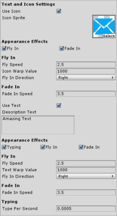
| Name | Description |
|---|---|
| Use Icon | If set true, an icon will be displayed where Icon UI is residing |
| Icon Sprite | Select what icon you want it to be |
| Fly In | If set true, the icon/text will fly into the scene |
| Fly Speed | How fast do you want icon/text to fly in? |
| Warp Value | How far away to teleport icon/text from its current position (to be calculated automatically in future release) |
| Fly In Direction | Specifies from which direction should icon/text fly into the scene |
| Fade In Speed | Specifies how fast does text/icon fade in |
| Use Text | If set true, a text will be displayed where Text UI is residing |
| Type Per Second | Specifies how many characters per second are displayed |
| Description Text | These should contain instructions to the player. E.g. "Press this button to continue" |
Audio Settings
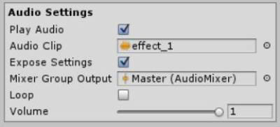
| Name | Description |
|---|---|
| Play Audio | If set true, audio clip will be played when the frame start |
| Audio Clip | What audio clip do you want to be played? |
| Expose Settings | If true, additional audio settings will be used |
| Mixer Group Output | Which mixer group do you want audio source to belong to? |
| Loop | If true, audio clip will loop |
| Volume | Change the volume of the audio clip. 1 is default. 0 is mute |