Highlighter Marker
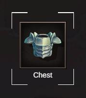
Settings
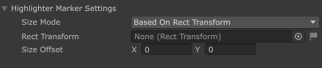
The Highlighter Marker is a built-in Marker that creates a visual highlight around UI elements to draw the Player's attention to specific areas of the interface.
Size Mode
The Size Mode determines how the Highlighter's dimensions are calculated:
| Mode | Description |
|---|---|
| Based On Rect Transform | The Highlighter's size is automatically determined by the dimensions of a referenced RectTransform |
| Manual | The Highlighter's size is manually specified using custom values |
Configuration Options
Based On Rect Transform
| Setting | Description |
|---|---|
| Rect Transform | The UI element's RectTransform that will be used to determine the Highlighter's size |
| Size Offset | Additional padding (in pixels) to add to the Highlighter's dimensions (X: horizontal, Y: vertical) |
The Highlighter will automatically adjust its size to match the referenced RectTransform, plus any Size Offset values. This is useful for highlighting UI elements that may change size dynamically.
Manual
| Setting | Description |
|---|---|
| Custom Size | The exact dimensions for the Highlighter in pixels (X: width, Y: height) |
Manual mode allows you to specify precise dimensions for the Highlighter, regardless of any UI elements.
Creating your own
Prerequisites
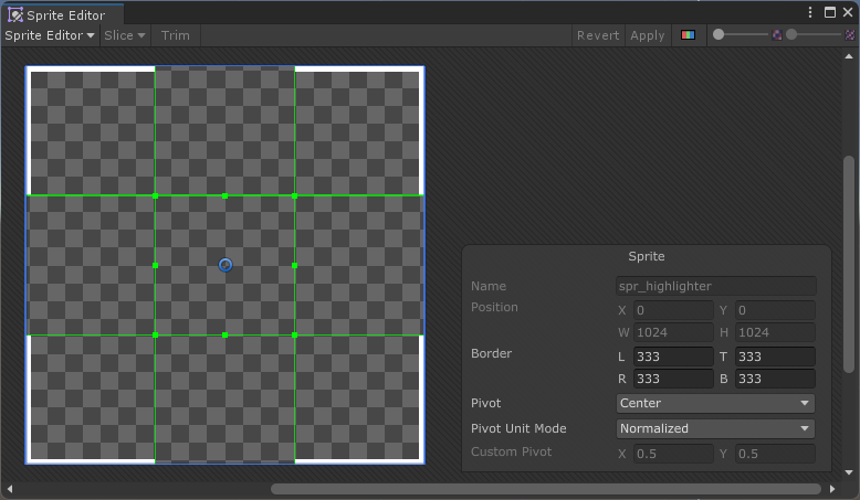
In order for Highlighter sprite to stretch accordingly, you must set the borders of said sprite accordingly.
In the Image component, the Image Type must be set to Sliced.
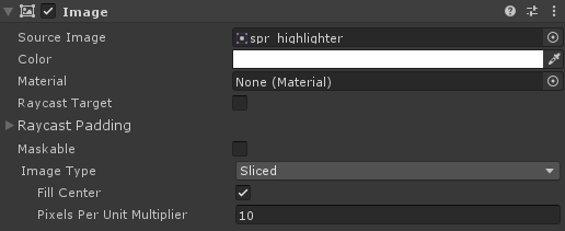
- Create a UI with an Image component
Anchors must be centered. The dimensions of the UI do not matter.
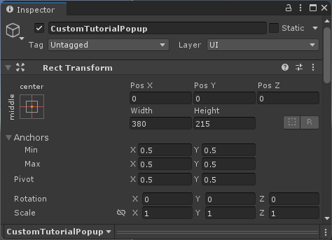
- At the root of the object, assign a Highlighter Marker component
- You can also add it by clicking Add Component > Tutorial Master > Markers > Highlighter Marker
- Save your new UI as a Prefab
Follow this guide to learn how to add your new Marker and use it for tutorials.